Changelog 08-2026: the new profile editor
Tools in this post

Until today, every Stackness profile looked the same. Your tools were grouped by their catalog categories, in a fixed grid you could not change. That grouping works for browsing the catalog, but it says nothing about how you work.
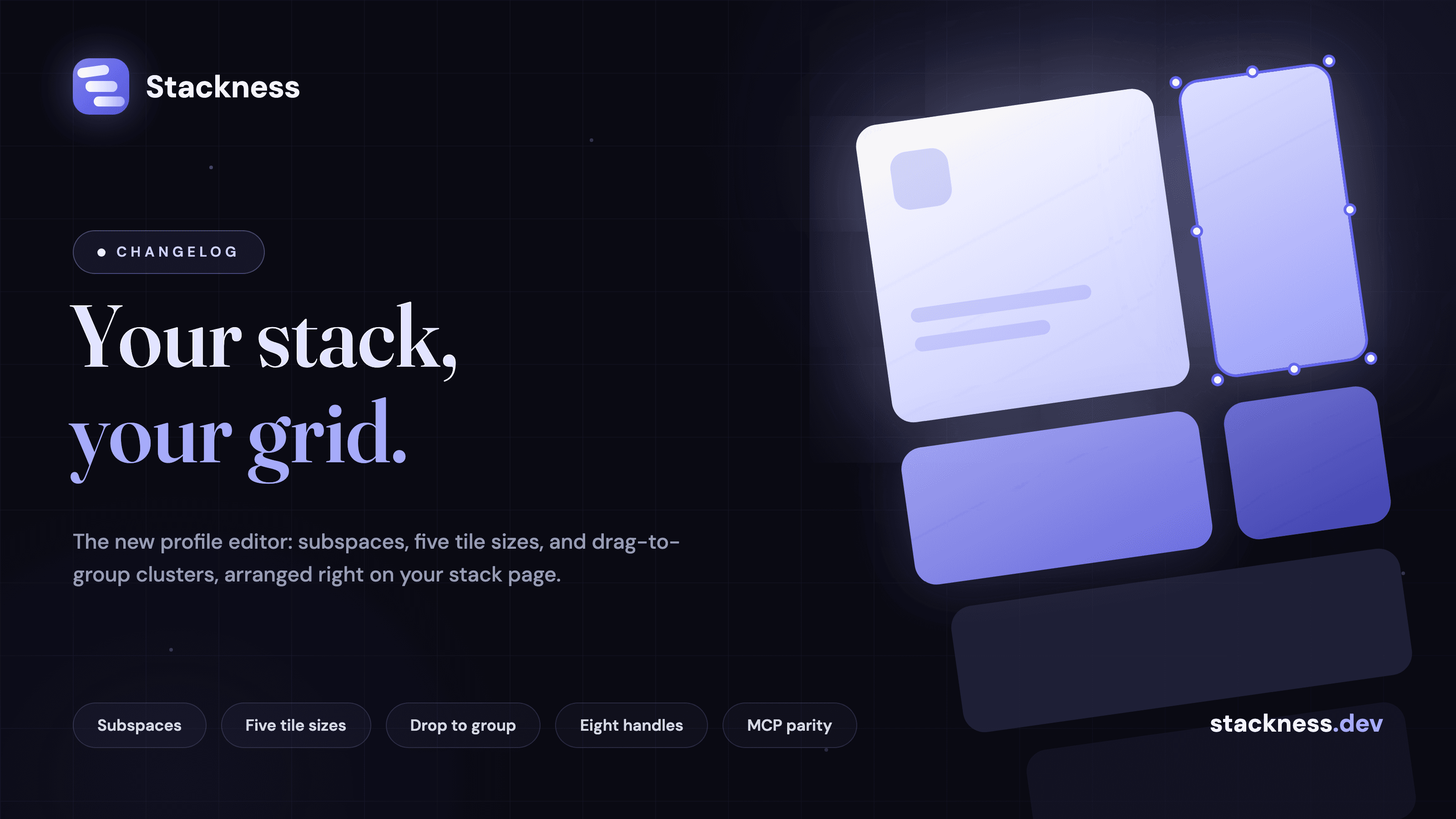
This release replaces that grid with a profile editor. Your stack page is now a bento grid you arrange yourself: you decide what sits where, which tools get the big tiles, and what belongs together.

Subspaces instead of categories
The building block is a subspace: a named, coloured, collapsible panel that holds tools and moves in any arrangement. "Daily drivers", "Ship it", "Weekend experiments" - whatever groups make sense for how you work. Each subspace gets one of eight colours, shown as a dot in the header and a light wash behind the tiles. Panels can be full or half width, can start collapsed for visitors, and have stable deep links like /stck/you#daily-drivers-42 that keep working after a rename.
Existing stacks were migrated automatically: every category you used became a subspace with the same name, so no profile broke in the switch. Categories still work everywhere else - explore, tool pages, the add dialog. They just no longer control your profile layout.
Five tile sizes, eight handles
Arranging happens directly on your stack page. Click a tile once and it gets a selection ring with eight handles: four corners, four edges. Drag any of them and the tile snaps between five sizes - small, normal, wide, tall and featured. Edges resize one axis, corners resize both. While you drag, a dashed preview shows the size you are about to get, and the other tiles animate to their new spots. You can also resize with the arrow keys, and screen readers announce the current size.
A tool card with a cover image can use it as the tile background. Move cards get a badge and a watermark, so they are easy to tell apart from tools.
Drop to group
Drag one small tile onto another and you get a cluster: a compact group shown as stacked icons with a count. Click it and it expands into mini chips. Name it when it forms, rename it later, drag a chip out to ungroup it. Clicking anywhere on the cluster header collapses it, not just the chevron. Clusters are good for the small utilities that belong in your stack but do not need a full card each.
Agents arrange too
Everything the editor does, the API and MCP server can do too. Subspace and cluster CRUD plus a batch PUT /api/v1/stack/layout endpoint landed alongside the UI, and the MCP server got matching tools: subspace_create, subspace_update, cluster_create, stack_layout_get, stack_layout_update and more. An agent can read your whole layout, restructure it, and put everything back. The live conformance suite does that on every run. Documented at stackness.dev/docs/api.
Also in this release
Collections are gone. Subspaces cover the same job, so I removed the tab, the pages and the API instead of keeping two versions of the same feature.
"To try" is now "Bookmarks", at
/bookmarks. The bookmark button is back on every surface where you decide to try something: profiles, tool and move pages, and both directories.One History tab. The activity timeline, the charts and the stack-over-time view were three separate places. They are now one History tab on every profile.
The tool page got a redesign. The adoption history charts moved to the top, and "also used with" shrank from a third of the page to a compact strip.
Usage dates are month and year now. Nobody remembers the exact day they started using Postgres, so the forms no longer ask for one.
The onboarding tour got a second pass. It covers the new profile, survives a reload, and only counts as done when you actually finish it.
Plus smaller fixes: copying a tool you already own now says "already in your stack", profiles no longer show a stale grid right after you publish, collapse and expand are animated, and every page gets a light entrance animation with no LCP or CLS cost.
The fastest way to see it all is your own stack page. Click a tile and drag a corner.
New posts by email
About one email a week with what we published. No account needed.
One email to confirm first. Every email has a one-click unsubscribe.
Which of these do you use?
Tick the ones you run and save them as your stack. It takes a couple of minutes.